

100% Accurate Answers! Jul-2025 Web-Development-Applications Actual Real Exam Questions
Best Value Available! 2025 Realistic Verified Free Web-Development-Applications Exam Questions
NEW QUESTION # 32
Given the following CSS: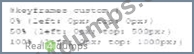
What is being configured?
- A. Processing in the browser
- B. Rendering to the canvas
- C. Processing on a server
Answer: A
Explanation:
The given CSS configures properties that control the processing of animations directly in the browser.
* CSS Animations: CSS animations are processed by the browser's rendering engine. The animations defined by CSS are handled client-side and do not require server-side processing.
* Key Properties:
NEW QUESTION # 33
Which HTML tag should a developer use to create a drop-down list?
- A. <Option>
- B. <Output>
- C. <Section >
- D. <Select>
Answer: D
Explanation:
The <select> tag is used in HTML to create a drop-down list. It is used in conjunction with the <option> tags to define the list items within the drop-down menu.
* Purpose of <select>: The <select> element is used to create a control that provides a menu of options.
The user can select one or more options from the list.
* Structure of Drop-down List:
* The <select> element encloses the <option> elements.
* Each <option> element represents an individual item in the drop-down list.
* Usage Example:
<label for="cars">Choose a car:</label>
<select id="cars" name="cars">
<option value="volvo">Volvo</option>
<option value="saab">Saab</option>
<option value="fiat">Fiat</option>
<option value="audi">Audi</option>
</select>
In this example, the <select> tag creates a drop-down list with four options: Volvo, Saab, Fiat, and Audi.
* Attributes of <select>:
* name: Specifies the name of the control, which is submitted with the form data.
* id: Used to associate the <select> element with a label using the <label> tag's for attribute.
* multiple: Allows multiple selections if set.
References:
* MDN Web Docs on <select>
* W3C HTML Specification on Forms
NEW QUESTION # 34
Which attribute is related to moving the mouse pointer of an element?
- A. Onmouseover
- B. Onmouseup
- C. Onmouseout
- D. onmouseenter
Answer: A
Explanation:
The onmouseover attribute in HTML and JavaScript is used to execute a script when the mouse pointer is moved over an element.
* onmouseover Attribute: This event occurs when the mouse pointer is moved onto an element. It is commonly used to change styles or content of the element when the user interacts with it by hovering.
* Usage Example:
<p onmouseover="this.style.color='red'">Hover over this text to change its color to red.</p> In this example, the text color changes to red when the mouse pointer is moved over the paragraph.
References:
* MDN Web Docs on onmouseover
* W3C HTML Specification on Events
NEW QUESTION # 35
Given the following CSS statement: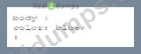
Which code segment changes the font color when the viewport is 800 pixels wide or wider?
- A.

- B.

- C.

- D.

Answer: C
Explanation:
To change the font color when the viewport is 800 pixels wide or wider, a media query with min-width:
800px is used. This ensures that the styles inside the media query are applied only when the viewport width is at least 800 pixels.
* CSS Media Queries:
* Syntax for Media Query:
@media screen and (min-width: 800px) {
body {
color: black;
}
}
* Explanation: The min-width: 800px condition ensures that the styles are applied when the viewport is 800 pixels or wider.
* Example Analysis:
* Option A:
@media screen and (min-width: 800px) {
body {
color: black;
}
}
* Correct. This applies the color: black; style to the body when the viewport is 800 pixels or wider.
* Option B:
@media min-width: 800px {
body {
color: black;
}
}
* Incorrect. Missing screen and which is required for a proper media query targeting screens.
* Option C:
@media screen and (max-width: 800px) {
body {
color: black;
}
}
* Incorrect. This applies the style when the viewport is 800 pixels or narrower.
* Option D:
@media max-width: 800px {
body {
color: black;
}
}
* Incorrect. This applies the style when the viewport is 800 pixels or narrower.
* References:
* MDN Web Docs - Using media queries
* W3Schools - CSS Media Queries
The correct use of media queries ensures that the specified styles are applied only under the desired conditions, providing a responsive design.
NEW QUESTION # 36
Given the following code:
What does the console display as output?
- A. 0
- B. 1
- C. 2
Answer: B
Explanation:
Given the code segment:
var a = "8";
var b = "6";
var c = a + b;
console.log(c);
This code concatenates two strings.
* Explanation:
* var a = "8";: Variable a is assigned the string "8".
* var b = "6";: Variable b is assigned the string "6".
* var c = a + b;: The + operator concatenates the two strings, resulting in "86".
* console.log(c);: Outputs the value of c to the console.
* Output:
* The console displays "86" because it concatenates the two string values.
* References:
* MDN Web Docs - String
* W3Schools - JavaScript String
NEW QUESTION # 37
Given the following HTML statement:
And the following style:
Which line of the changes the background color of the <div> tag when the width is between 600 pixels and
900 pixels or more than 1, 100 pixels?
- A.

- B.

- C.

- D.

Answer: D
Explanation:
The given HTML and CSS statements define a class named "example" and use media queries to change the background color of the <div> element based on the screen width. The correct CSS media query to change the background color of the <div> tag when the width is between 600 pixels and 900 pixels or more than 1100 pixels is:Copy code
@media screen and (max-width: 900px) and (min-width: 600px), (min-width: 1100px) { div.example { background: yellow;
}
}
* Understanding Media Queries:
* @media screen: Applies the styles only for screens.
* (max-width: 900px) and (min-width: 600px): Targets screen widths between 600 and 900 pixels.
* , (comma): Acts as an "or" operator in media queries.
* (min-width: 1100px): Targets screen widths greater than or equal to 1100 pixels.
* Option C Explanation:
* This option uses the correct media query syntax to apply the background color change when the screen width is between 600 and 900 pixels or when it is 1100 pixels or more.
References:
* MDN Web Docs on Media Queries
* W3C CSS Media Queries Level 4
The correct CSS media query based on the provided options is:
@media screen and (max-width: 900px) and (min-width: 600px), (min-width: 1100px) { div.example { background: yellow;
}
}
References for Media Queries:
* MDN Web Docs on Using Media Queries
* W3C CSS Media Queries Module Level 4
NEW QUESTION # 38
Which method retrieves periods updates about the geographic location of a user:
- A. ClearWatch
- B. getCurrentPosition
- C. WatchPosition
- D. GetContext
Answer: C
Explanation:
The watchPosition method in the Geolocation API is used to get periodic updates about the geographic location of a user.
* watchPosition Method: This method calls the provided callback function with the user's current position as the device's location changes.
* Usage Example:
navigator.geolocation.watchPosition(function(position) {
console.log("Latitude: " + position.coords.latitude + ", Longitude: " + position.coords.longitude);
});
In this example, the watchPosition method continuously logs the user's latitude and longitude to the console as the position changes.
References:
* MDN Web Docs on watchPosition
* W3C Geolocation API Specification
NEW QUESTION # 39
Which element relies on the type attribute to specify acceptable values during form entry?
- A. <Option>
- B. <Button>
- C. <Select>
- D. <input>
Answer: D
Explanation:
The <input> element relies on the type attribute to specify acceptable values during form entry. Different input types include text, email, number, password, etc.
* Input Types: The type attribute determines the kind of input control and the acceptable values for that control.
* Usage Example:
<input type="email" placeholder="Enter your email">
<input type="number" min="1" max="10">
These input elements specify acceptable values for email and number inputs respectively.
References:
* MDN Web Docs on <input>
* W3C HTML Specification on Input Types
NEW QUESTION # 40
Which element attaches an external CSS document to a web page?
- A. <Meta>
- B. <Script>
- C. <Link>
- D. <style>
Answer: C
Explanation:
To attach an external CSS document to a web page, the <link> element is used within the <head> section of the HTML document.
* <link> Element:
* Purpose: Links external resources, such as stylesheets, to the HTML document.
* Attributes:
* rel="stylesheet": Specifies the relationship between the current document and the linked resource.
* href="path/to/stylesheet.css": Specifies the URL of the external stylesheet.
* Example:
<head>
<link rel="stylesheet" href="styles.css">
</head>
* Other Options:
* <style>: Used to embed internal CSS directly within the HTML document, not for linking external CSS.
* <script>: Used to embed or link to JavaScript files.
* <meta>: Provides metadata about the HTML document, not for linking stylesheets.
* References:
* W3C HTML5 Specification - The link element
* MDN Web Docs - <link>
By using the <link> element correctly, you can ensure that your web page is styled with external CSS, maintaining a separation of concerns and making your HTML more manageable.
NEW QUESTION # 41
Given the following code: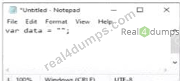
What is the value of the variable data when the code runs?
- A. Null
- B. A single-character string
- C. Undefined
- D. An empty string
Answer: D
Explanation:
In JavaScript, assigning an empty pair of quotes to a variable creates an empty string.
* Variable Assignment:
* Given the code:
var data = "";
* The variable data is assigned an empty string.
* Explanation:
* Option A: Null is incorrect because the variable is assigned an empty string, not null.
* Option B: A single-character string is incorrect because the string is empty.
* Option C: Undefined is incorrect because the variable is assigned a value, even though it is an empty string.
* Option D: An empty string is correct because "" represents an empty string.
* References:
* MDN Web Docs - String
* W3Schools - JavaScript Strings
NEW QUESTION # 42
Which code segment creates a slider field that accepts a numeric value ranging from 1 through 10?
- A.

- B.

- C.

- D.

Answer: D
Explanation:
To create a slider field that accepts a numeric value ranging from 1 through 10, the input element with type=" range" should be used. The min and max attributes define the range of acceptable values.
* HTML Input Type range:
* Purpose: The range type is used for input fields that should contain a value from a specified range.
* Attributes:
* type="range": Specifies that the input field should be a slider.
* min="1": Sets the minimum acceptable value.
* max="10": Sets the maximum acceptable value.
* Example:
* Given the HTML:
<input type="range" name="sat-level" min="1" max="10">
* Options Analysis:
* Option A:
<input type="number" name="sat-level" max="10">
* This creates a numeric input field, not a slider.
* Option B:
<input type="range" name="sat-level" min="1" max="10">
* This is the correct option that creates a slider field with the specified range.
* Option C:
<input type="number" name="sat-level" min="1" max="10">
* This creates a numeric input field, not a slider.
* Option D:
<input type="range" name="sat-level" max="10">
* This creates a slider but lacks the min attribute, so it doesn't fully meet the requirement.
* References:
* MDN Web Docs - <input type="range">
* W3Schools - HTML Input Range
By using the correct attributes, the slider field will allow users to select a value between 1 and 10.
NEW QUESTION # 43
Which framework assists designers with adaptive page layout?
- A. Bootstrap
- B. Modernize
- C. Knockout
- D. React
Answer: A
Explanation:
Bootstrap is a popular front-end framework that assists designers in creating adaptive and responsive page layouts easily.
* Bootstrap:
* Responsive Design: Bootstrap provides a responsive grid system, pre-styled components, and utilities that help in designing adaptive layouts.
* Example:
<div class="container">
<div class="row">
<div class="col-sm-4">Column 1</div>
<div class="col-sm-4">Column 2</div>
<div class="col-sm-4">Column 3</div>
</div>
</div>
* Other Options:
* A. Modernize: Not a framework, but a JavaScript library to detect HTML5 and CSS3 features.
* C. React: A JavaScript library for building user interfaces, not specifically for layout.
* D. Knockout: A JavaScript library for implementing MVVM pattern, not specifically for layout.
* References:
* Bootstrap Documentation
* MDN Web Docs - Responsive design
These answers ensure accurate and comprehensive explanations for the given questions, supporting efficient learning and understanding.
NEW QUESTION # 44
What allows a scripting language to manipulate elements on a web page?
- A. HTML
- B. XML
- C. DOM
- D. CSS
Answer: C
Explanation:
The Document Object Model (DOM) is an API for HTML and XML documents that defines the logical structure of documents and the way a document is accessed and manipulated.
* DOM Explanation:
* The DOM represents the page so that programs can change the document structure, style, and content.
* It provides a way for scripts to update the content, structure, and style of a document while it is being viewed.
* Explanation:
* Option A: CSS is incorrect because it is used for styling web pages.
* Option B: XML is incorrect because it is a markup language, not an API for manipulating web page elements.
* Option C: HTML is incorrect because it is the markup language used to create web pages, not an API for manipulation.
* Option D: DOM is correct because it allows a scripting language to manipulate elements on a web page.
* References:
* MDN Web Docs - DOM
* W3Schools - JavaScript HTML DOM
NEW QUESTION # 45
What is the process for JavaScript from validation?
- A. Form fields are validated as me user inputs data after form data is sent to the server.
- B. User input is sent to the server after the form is completed tor validation.
- C. User input is sent to the server as fields are completed for validation.
- D. Form fields are validated after the form is submitted but before form data is sent to the server
Answer: D
Explanation:
JavaScript form validation typically occurs after the form is submitted but before the form data is sent to the server. This allows the client-side script to check the input data and prevent the form from being submitted if the data is invalid.
* Client-Side Validation:
* Before Form Submission: JavaScript validates the form fields after the user attempts to submit the form.
* Prevent Default Submission: If the validation fails, JavaScript can prevent the form from being submitted and display appropriate error messages.
* Usage Example:
document.getElementById("myForm").addEventListener("submit", function(event) { var isValid = true;
// Perform validation checks
if (!isValid) {
event.preventDefault(); // Prevent form submission
alert("Please correct the errors.");
}
});
This example prevents form submission if the validation fails.
References:
* MDN Web Docs on Form Validation
* W3C HTML Specification on Form Submission
NEW QUESTION # 46
What is a common technique to ensure users can access all content on a mobile web page?
- A. Navigation links requiring scrolling
- B. Access to multiple link layers
- C. Targeted site content
- D. A link to the full site
Answer: D
Explanation:
Providing a link to the full site on a mobile web page is a common technique to ensure users can access all content if they find the mobile version limiting.
* Advantages:
* Access to Full Functionality: Users can switch to the desktop version if they need features not available on the mobile site.
* User Control: It gives users the choice to view the site in a layout they are more comfortable with.
* Other Options:
* A. Access to multiple link layers: This does not directly address user needs for full site access.
* B. Targeted site content: While important, it does not replace the need for a full site link.
* D. Navigation links requiring scrolling: This can worsen the user experience on mobile devices.
* References:
* Google Developers - Mobile Site Design
NEW QUESTION # 47
Which technique should a developer use for text-based hyperlink on mobile web page?
- A. Keeping links uniform
- B. Padding the clickable area around the link
- C. Deploying graphical links
- D. Using dynamic page elements neat the link
Answer: B
Explanation:
When designing text-based hyperlinks for mobile web pages, it is essential to ensure that the links are easily tappable. Adding padding around the clickable area increases the touch target size, making it easier for users to interact with the link on a mobile device.
* Techniques for Mobile-Friendly Links:
* Padding the Clickable Area: By adding padding, you increase the touchable area around the link, which helps prevent user frustration due to missed taps.
* CSS Example:
a {
padding: 10px;
display: inline-block;
}
* Other Options:
* B. Keeping links uniform: This refers to making all links look the same, which is good for consistency but doesn't specifically address the issue of touch targets.
* C. Deploying graphical links: While graphical links can be effective, they do not necessarily improve touch target size for text-based hyperlinks.
* D. Using dynamic page elements near the link: This can lead to a cluttered interface and does not address the touch target issue directly.
* References:
* MDN Web Docs - Touch targets
* Google Developers - Mobile Web Development
NEW QUESTION # 48
Which layout method causes images to render to small or too large in browser windows of different sizes?
- A. Liquid
- B. Relative width
- C. Fixed width
- D. Fluid
Answer: C
Explanation:
A fixed-width layout method specifies exact pixel values for widths. This approach does not adapt to different screen sizes, leading to images rendering too small or too large on various devices.
* Fixed Width Layout:
* Definition: Uses specific pixel values for the width of elements.
* Example:
container {
width: 800px;
}
* Issues:
* Lack of Flexibility: Does not scale with the size of the viewport, causing images and other elements to appear incorrectly sized on different screen sizes.
* Comparison:
* Fluid/Liquid: Adapts to the screen size using percentages or other relative units.
* Relative Width: Also adapts using units like em or %.
* References:
* MDN Web Docs - Fixed vs. Fluid Layout
* W3C CSS Flexible Box Layout Module Level 1
Using fixed-width layouts can result in poor user experience across different devices, highlighting the importance of responsive design principles.
Top of Form
Bottom of Form
NEW QUESTION # 49
Which History API object is called when a browser window's document history changes?
- A. Window, open
- B. Window, location
- C. Window, onpopstate
- D. Window, name
Answer: C
Explanation:
The onpopstate event is triggered in the window object when the active history entry changes, such as when the user navigates to a different page using the back or forward buttons in the browser.
* History API and onpopstate:
* Event: window.onpopstate
* Description: This event is fired when the user navigates to a session history entry, i.e., when moving backwards or forwards in the browser history.
* Example:
window.onpopstate = function(event) {
console.log("location: " + document.location + ", state: " + JSON.stringify(event.state));
};
* Other Options:
* A. Window, location: location is an object containing information about the current URL.
* C. Window, name: name is a property to set or get the name of a window.
* D. Window, open: open is a method to open a new browser window or tab.
* References:
* MDN Web Docs - window.onpopstate
* W3Schools - JavaScript History API
NEW QUESTION # 50
A file named application, Appchache contains the following content:
Which attribute should a developer set to application. Appchache so the four files will be cached?
- A. The manifest attribute of the <html> element
- B. The href attribute of the <Link> element
- C. The srcset attribute of the <source> element
- D. The src attribute of the <script> element
Answer: A
Explanation:
To specify a cache manifest file for an HTML document, the manifest attribute must be set in the <html> element. This attribute tells the browser to cache the files listed in the manifest for offline use.
* Cache Manifest:
* Purpose: Specifies resources that should be cached by the browser.
* Attribute: manifest is used in the <html> tag to link the cache manifest file.
* Example:
* Given the manifest file application.appcache:
CACHE MANIFEST
CACHE:
default.html
stylesheet.css
functions.js
logo.jpg
* HTML with the manifest attribute:
<html manifest="application.appcache">
</html>
* References:
* MDN Web Docs - Offline Web applications
* W3C HTML5 Specification - manifest attribute
NEW QUESTION # 51
Given the following CSS code:
How many seconds elapse before the font-size property begins to increase when a user hovers a mouse pointer over the delay element?
- A. 0
- B. 1
- C. 2
- D. 3
Answer: D
Explanation:
The CSS transition-delay property specifies how long to wait before starting a property transition. In the given CSS code, the transition-delay is set to 2s.
* CSS Transition Properties:
* transition-property: Specifies the CSS property to which the transition is applied (font-size in this case).
* transition-duration: Specifies how long the transition takes (4s).
* transition-delay: Specifies the delay before the transition starts (2s).
Example:
* Given HTML:
<div id="delay">Hover over me</div>
* Given CSS:
#delay {
font-size: 14px;
transition-property: font-size;
transition-duration: 4s;
transition-delay: 2s;
}
#delay:hover {
font-size: 36px;
}
Explanation: When a user hovers over the element with id="delay", it will wait for 2 seconds before the transition effect on font-size starts.
References:
* MDN Web Docs - transition-delay
* W3C CSS Transitions
NEW QUESTION # 52
......
Actual Questions Answers Pass With Real Web-Development-Applications Exam Dumps: https://www.real4dumps.com/Web-Development-Applications_examcollection.html
Pass Your Exam Easily! Web-Development-Applications Real Question Answers Updated: https://drive.google.com/open?id=1jBSigtNH7Eeg3HClYL5C2ViuABAPAsX0
